If you've been deeply into the internet lately, you may have seen people posting AI generated images from Dall E (a mashup of Wall:E and Dali, as in Salvador). It takes text prompts and turns them into a set of 9 computer generated, often absurdist and terrifying images. The only limit is your imagination.
One user tried her hands at simply replicating corporate brands, and with hilarious results. The entire thread is wacky. I haven't been able to get Dall E to put recognizable letters in many spots yet (Edit: I found it is because she is using Dall E 2, which I won't bother to get access for), but she did, and it is weird. Naturally, I had to try it, and did so with the Twins. My prompt was "Minnesota Twins alternate logo" in the hope that it would tap into the Minnie and Paul shaking hands across the Mississippi logo. In the end, all it did was give me a red background for most of them. Fair.
.png)
#1: This is the only one with a white background. I like that it appears to be painted on a deck, and how the C is folded into the top of the T. Clever!
.png)
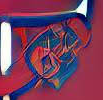
#2: This looks like an upside down anchor. You can sort of make out a T, but the rest looks not unlike an upside down S and a P. A T with an S and a P..... This is a secret Saints logo!
.png)
#3: This is clearly a T and a C, and it looks like a little fish in the bottom, but I am not sure what is going on on the right side of this picture. Looks a little like a lacrosse stick, or that thing they use in jai alai. You know, jai alai.
.png)
#4: This is a nightmare. It looks like a drunken Detroit script D, which dropped it's bottle of booze because it was trying to hold it with a baseball glove. These things are a real Rorschach test.
.png)
#5: This is a T falling in a hole, as painted by MC Escher.
.png)
#6: Listen, the Twins have been going to a more red focused theme for a while now, but we don't have to give them a fully red ensemble in their logo, do we? Oh, you're going to put a floor length overcoat on it? Cool, then, I guess.
.png)
#7: You can see the vaguest semblance of a T here, but the swooping red lines are really only designed to accost that black and orange thing. What is that thing? Why, it looks like a Baltimore Orioles head that is extremely unhappy to have a red swoosh shoved into it.
You don't have to like it, but it's there.
.png)

No comments:
Post a Comment